
We redesigned the Craig Hospital website to better express its unique qualities and provide a clear understanding of what it means to be a part of the Craig community.
Overview
We worked with Craig Hospital, a world-renowned rehabilitation hospital that exclusively specializes in neurorehabilitation and research for individuals with spinal cord injury and brain injury, to reimagine the user journey of their website.
Challenge
While Craig is highly recommended as the best option among doctors and nurses, we needed to digitally transform the Craig Hospital website, to better articulate its differentiators and clearly communicate what it’s really like to become part of the Craig family.

Approach
We undertook stakeholder interviews with key teams at Craig Hospital to understand their business needs and the needs of their audience and website users. Some of the key teams included; Admissions & Provider Relations, Clinical Services, Human Resources & Careers, Craig Foundation, Nursing, Marketing & Communications, Research and Therapy teams.
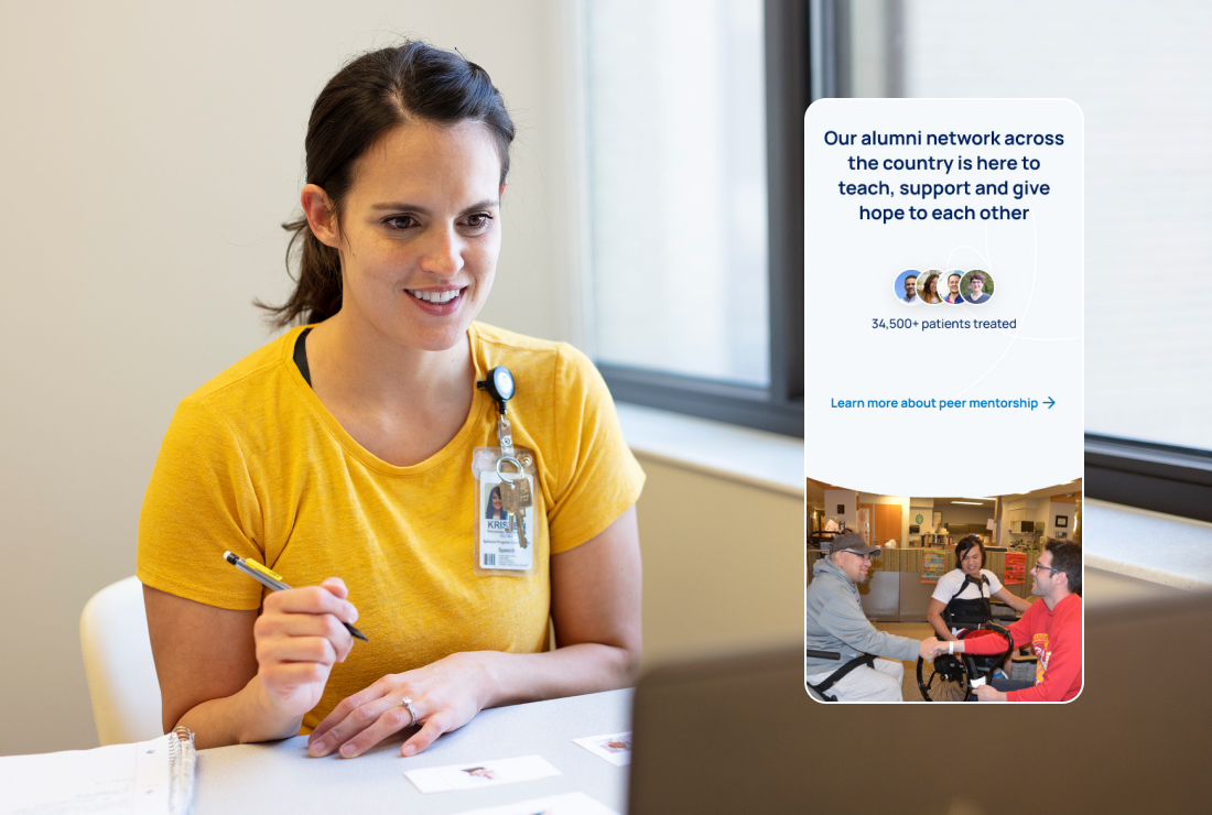
These interviews were invaluable to gather insights and underlined that the website needed to support a wide range of target audiences. With each audience needing specific content needs. The primary audiences were distilled down to the following; Patients & Families, Clinicians & Therapists, Payers & Case Workers, Donors and Alumni.
We did a competitor analysis to gauge how the current Craig Hospital website stands amongst their competition, and to see how others are perceived. This gave us a benchmark of what they are doing well, and what can be improved.
What was really clear is Craig had an outstanding reputation of success, with many previous patient stories speaking to the incredible job that Craig Hospital does, and how you truly are part of the family once you arrive at Craig.
Some of the common themes gathered from Stakeholder interviews and competitor analysis that the new website needed to achieve were:
- Better Access to Resources - The ability to pull in relevant Resource Library and blog assets is also a must. Podcasts and webinars are new!
- More categories and Filtering - Adding more filters will allow for easier cross referencing across the site.
- Encourage more engagement - help encourage more exploration, donations and engagement throughout the website.
- Calendar of events - Craig, Craig Foundation and Operation TBI Freedom all have event calendar needs. The ability to feature offsite community events is also necessary.
- Ability to print - Creating print-friendly HTML pages will assist when PDFs are not already available for download.
- Better Site search - Improved site search was mentioned by many team. Looking into Algolia’s site search options and alternatives will be part of our discovery moving forward.
- Updated Content - Many teams mentioned text, photos and video content that was outdated or missing. Differentiators, Craig 101 and a separation of inpatient and outpatient therapy information are areas that need attention.
- Craig is about movement and empowerment - We heard the desire for auto play video content because Craig is about movement and being active, not static. We also heard concerns for auto play video for this audience. The site should be light and showcase patient empowerment.
- Compliance is paramount - Ensuring we’re adhering to compliance guidelines for visual contrast and keeping screen readers in mind is important.
- Ease of use - Quick access, printable pages, easy search, quick guides. Getting to resources and content quickly and easily is important.
- More photography should be used throughout the website - To convey the warmth, love and family-feel of Craig, we need more photos throughout the website, of patients and staff.
- Using real photography is a must - Showcasing real patients in action is a must. Patients should be engaged in activities, therapy and movement. There isn’t a lot of sitting around at Craig.
- Showcase technology - We’re using the latest techniques, technology and research to ensure our patients have the best possible outcomes.
Based on our research we reordered the site map and overhauled the user experience to better achieve the new website goals.

Solution
For the new look website we had some north stars of how we wanted Craig Hospital to feel. They were important reference points throughout my design phase, along with the website goals and KPIs. This is how we wanted the Craig Hospital brand to feel:
- Empowering and Hopeful - It’s going to be hard work, but we’re here to empower you to get back home and living your life.
- Warm and Friendly - We’re true partners to you and your family. Once you’re at Craig, you’re always part of our family.
- Innovative and Cutting Edge - There is no canned approach to what we do. We’re using the latest techniques, technology and research to ensure our patients have the best possible outcomes.
- We’ve got your back - We’re ready to go to bat for you, ensuring you get the time you need to heal at Craig. From talking to insurance companies to assisting you achieve your goals, we’re here for you.
From researching competitors and the medical digital landscape, it was clear to see that the common themes of websites were very sterile, overly clean to the point of being cold and impersonal, and use of a lot of straight hard lines.
With the Craig site we knew we wanted to bring in that family feel that is one of their differentiators and humanize the experience. So after diving into the existing brand guidelines, I leaned into the curves within the “C” of their logomark. Using curved elements throughout the site, particularly differentiating modules, soften the experience and brought in a more friendly feeling. By also bringing in animations and transitions as the user moves through each page, it made the experience more approachable and engaging, and gave that sense of movement that we so clearly wanted to communicate that Craig was all about.

Utilizing more of the secondary color palette of Craig Hospitals brand, the lighter blues and yellow, green and purple colors, again gave the website more of a warm and inviting feel. Particularly compared to competitors once consistently revert back to the cold uninviting blue theme. It was important to bring in those secondary colors as the Craig Hospital brand does anchor itself with their solid blue brand color.
Another important aspect of the new design was to highlight more photography and video throughout the website. Bringing real patients and staff to the forefront to convey the warmth, love and family-feel of Craig, and showcase the incredible environment they have created at Craig.
To better communicate the extensive services Craig Hospital has, I created a custom icon set.


Results
We digitally transformed the Craig Hospital website to better articulate its differentiators and clearly communicate what it’s really like to become part of the Craig family. The new website is meant to evoke feelings of empowerment and hopefulness, warmth and friendliness, innovation, and lastly supportiveness within all website visitors.
Visit the Craig Hospital website here.